Marble rarely behaves like a neutral. Even a slab that reads as soft white from across the room carries a vein pattern, a background temperature and a sense of scale — and all three of those things begin a conversation with your cabinetry the moment the lights come on. Get the pairing right and the kitchen feels settled, as though the stone and the joinery were chosen together. Get it wrong and no amount of styling rescues it: the cabinets look slightly dirty, or the marble looks flat, or the whole room hums with a noise nobody can quite name.
The good news is that this is not a matter of taste alone. There are readable relationships between vein intensity, background tone and cabinet colour, and once you can see them you can predict how a pairing will behave before anything is cut.
Read the slab before you read the swatch
Most people choose cabinets first and stone second, then try to make the stone fit. Reverse that order if you can. Marble has a stronger personality than paint, and it is far easier to move a cabinet colour than to change your mind about a slab you have already fallen for.
Stand in front of the slab and describe it in three words:
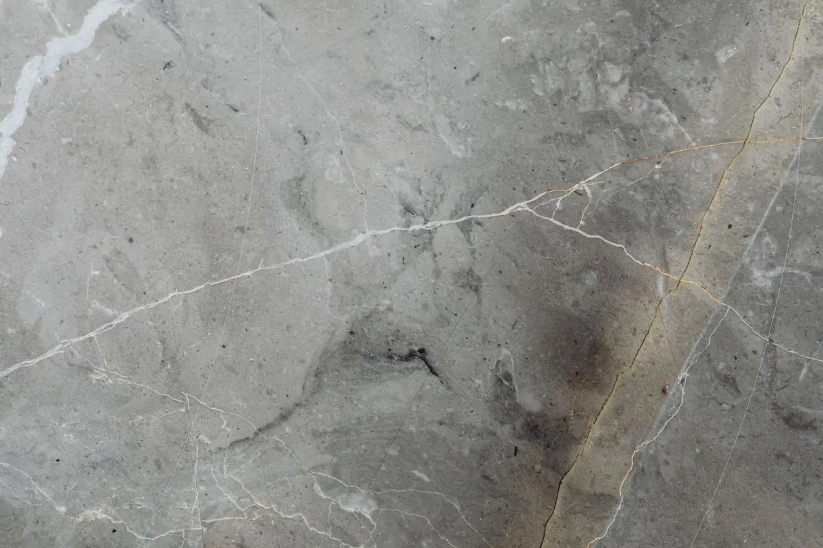
- Vein intensity. Quiet stone has faint, sparse veining that almost disappears at a distance. Moderate stone shows clear movement without dominating. Bold stone has thick, high-contrast veins that read as a graphic across the surface.
- Background tone. Not simply "white". Look for warm cream and ivory, cool grey and blue-grey, greenish casts, or a deep black ground. Hold a sheet of plain white paper against the slab — the difference you see is the undertone.
- Scale and direction. A wide, sweeping vein behaves very differently from a fine web of hairlines, and veins that run vertically on a tall splash read differently from the same stone laid flat on an island.
Ask to see the slab dry and wet, in daylight and under the light fittings you plan to use. Wet stone is closer to a polished finish; daylight reveals undertones that warm electric light hides.
The background tone sets the temperature
Almost every disappointing marble-and-cabinet pairing fails on temperature rather than colour. A stone with a warm, creamy ground next to cabinets in a cool blue-white will make both look off — the stone slightly yellow, the cabinets slightly grey. The same clash happens in reverse: cool grey marble against a warm cream door can make the paint look dingy rather than soft.
You are not looking for an identical match. You are looking for agreement. A warm-background marble sits comfortably with warm whites, off-whites, soft sage, olive, mushroom and natural oak. A cool-background marble is happier with crisp whites, blue-greys, navy, charcoal and blackened metal. Where a stone is genuinely neutral — a soft grey-white with no obvious cast — you have unusual freedom, which is one reason those slabs remain so popular.
Light direction matters here too. A north-facing kitchen pulls colour cooler; a room with strong afternoon sun warms everything it touches. If your kitchen is bright and cool, a stone that already reads cool will feel colder still.
Vein intensity and cabinet weight
Think of it as a balance of two voices. If the stone is speaking loudly, let the cabinets stay quiet. If the cabinets carry the colour story — a deep forest green, a rich navy, a warm clay — choose a stone with restrained veining so the two do not compete.
A useful rule: only one of the two should be the main event. Let the other one hold the room together.
Bold, dramatic veining works beautifully against flat, calm planes in white, bone, greige or pale oak, where the stone supplies all the movement the room needs. On the other side of the equation, a quiet, fine-veined marble is the ideal partner for saturated cabinetry, because it gives the colour a clean backdrop without echoing it.
Scale counts as well. A heavily veined slab on a small galley run can be overwhelming; the same stone on a generous island becomes the room's centrepiece. If you want a bookmatched or mirrored vein pattern, commit to it on one surface and keep everything else simple.
Cabinet colours and how each one meets stone
Warm white and cream
The safest pairing of all, provided the undertones agree. Team cream cabinets with warm-ground marble and you get a kitchen that feels like good linen. Pair them with a cool grey-white stone and the cream turns slightly sour.
Soft sage and olive
Green cabinetry loves a warm white marble with grey or gold-brown veining. The green picks up the cooler notes in the stone and the stone keeps the green from feeling heavy. Avoid very cool, blue-toned greens with creamy stone.
Navy and deep blue
Cool grey-veined marble against navy is one of the most reliable combinations in kitchen design. The strong colour grounds the room and the pale stone bounces light back. Keep the veining moderate so the blue stays the story.
Charcoal and black
Dramatic, but it needs generous light. Choose a marble with real contrast and a bright ground, otherwise the whole kitchen collapses into one dark mass. A visible vein against black cabinetry is genuinely striking.
Natural oak and walnut
Timber brings warmth and grain — a second pattern — so keep the stone relatively calm. A fine-veined white or grey marble against pale oak feels fresh; a softer, warmer stone suits walnut without fighting it.
Painted grey
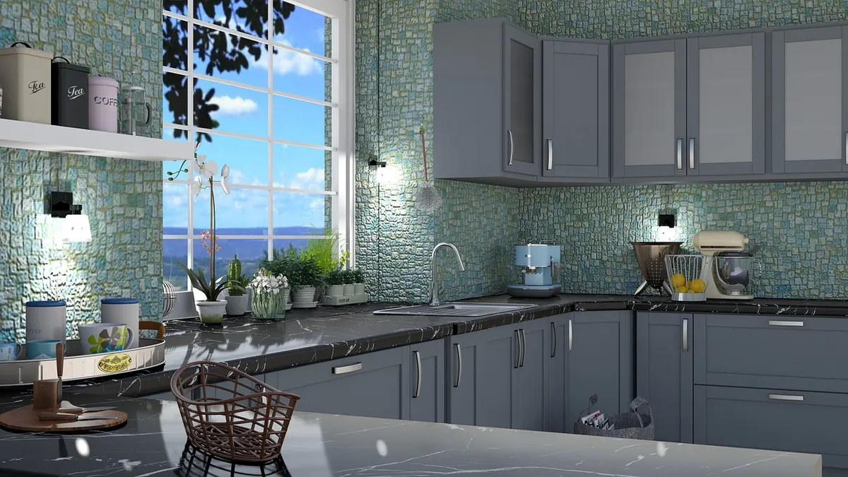
Handle with care. Grey cabinets plus grey-veined marble can flatten into a single tone with no depth. Push one direction: warmer greys with warm stone, cooler greys with cool stone, and always check the value contrast.
How to test a pairing before you commit
- Get physical samples. A screen photo is not a sample; a small chip is not a slab. Ask for a door in the actual finish and a piece of the actual stone.
- View them at counter height, standing where you will stand to chop vegetables — not from above or from a showroom sofa.
- Check the samples at three times of day, and again under your proposed lighting. Warm 2700–3000K bulbs will shift both paint and stone.
- Look at the seam line where cabinet meets counter. That junction is where temperature clashes show up first.
- Add the other players: floor, splashback, handles, tap. A brass handle can warm a cool stone; polished chrome can cool a warm one.
- Photograph the samples together in black and white. If the values are nearly identical, the room will read flat regardless of colour.
A short checklist before you sign off
Confirm the stone's background undertone matches the cabinet's undertone family. Make sure only one element is loud. Check the pairing at counter height in real light. Keep hardware and flooring in the sample cluster until the end. And if you are torn between two slabs, choose the calmer one — kitchens tolerate quiet surfaces for years and forgive dramatic ones less often than you would think.
Photo: 5460160 / Pixabay